Free as in available space (Nautilus & Gtk update)

One of the greatest things in contributing to GNOME is the ability to have a really close contact with highly skilled designers. We, mere programmers, learn a freakin’ lot by talking to them and trying to understand their points of view.

While working on the Other Locations view, one of the most requested features was the ability to see the free space of the disk. Seems like a simple and obvious feature, but after reworking a whole lot of components, it isn’t trivial to add it and make it look good, integrate well and behave perfectly.

An usual day in our designers’ life.

And, ladies and gentlemen, here I present you the simple but lovely work that just happened based on Allan’s work:

Captura de tela de 2015-12-11 02-46-39
Available space in filechooser

And, as always, I couldn’t let our beloved file browser behind:
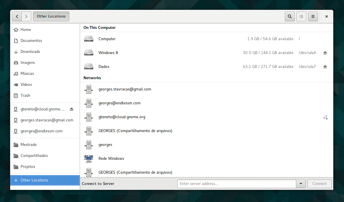
Captura de tela de 2015-12-11 02-45-11
Available space in Nautilus

This work already landed on master, and you can test it with JHBuild. Got any doubts? Comments? Suggestions? Leave a comment 🙂


28 responses to “Free as in available space (Nautilus & Gtk update)”

  1. damonlynch Avatar

    The screenshots are too small, making it rather difficult to see the new work. Having said that it seems like the “xx GB / xx GB available” is aligned on the /.

  2. Please add some kind of progress bar or graphical representation of the free space. Using text only makes it very hard to see free space on the first glance. Also, numbers don’t say much to some users, but percentage does (only 10% free, i.e. you need to delete something).

    1. The progress bars were the first thing I tried, but they didn’t work as well as I thought. The reasons:
      1. It consumes too much vertical space.
      2. It catches too much attention, and makes the whole view unbalanced.
      3. It changes row sizes and breaks the visual rhythm.

      In order to make it possible to add progress bars, they’d need to be very thin, which is not a good thing for users with accessibility requirements.

      TL;DR: progress bars didn’t fit well, labels are better in the end

      1. damonlynch Avatar

        In my opinion Microsoft did a good job with how they display free space in the “This PC” view of their file explorer, e.g.: http://media.askvg.com/articles/images5/Windows_8_1_Explorer_Single_Section.png

  3. Why showing /, /dev/sda7, … to user? It’s an unwanted information! (or a KDE feature)

    1. This feature was asked and discussed with many folks. It certainly is a wanted information, at least for advanced users 🙂

  4. It will be better if you can add some kind of progress bar or graphical representation of the free space like Kamil Páral said. You should also add the info on the drives in the left pane (https://bug751589.bugzilla-attachments.gnome.org/attachment.cgi?id=306199) to see free space on the first glance.

    1. I don’t particularly like that tiny progress bar. How much is used / free / total? Maybe users with visual disabilities would find it hard to see a 2px height bar. And it also breaks the vertical rhythm of the panel.

      1. I made a tiny bar because you at Gnome don’t want your softs to be cluttered. That’s a good thing but not at the cost of usefulness. I don’t mind something more visible.
        It’s problably best to “make something that looks good but not really useful”… I will never understand that way of thinking…
        No need to answer I give up…

  5. With the introduction of the copy/ download progress circle, it could be added here as well. As an indication of free space, add to that the free space in numbers, and you have a nice implementation.

    I agree with Cédric to leave out the mounting points.

  6. I wonder what the smallest pie circle graphical representation would look like hmmh.

    As a designer I might change the text to 1 / 15 hex level higher whiter. eg #222 – > #333.

    I love that I can easily get /dev/sd (letter) and size info.

    But one question – wouldn’t the drive letter change upon mounting to a mount location as the root directory is obviously listed by “path” and not “drive letter”.

    I wonder if it’s necessary to even include the prefix “/dev/” or even “dev/sd”X prefix.

    1. Actually, this may be a good addition to the labels. Small enough so it doesn’t take too much space and symbolic so it doesn’t catch too much attention. If you have a clear idea of that, would you mind sharing a quick draw or a mockup? Thanks! 🙂

  7. I agree that it wouldn’t hurt if there was even a graphical method as a circle or a bar. Good job anyway ; )

    1. Thanks! Remember that we’re always iterating over design, and if you have ideas (or even mockups!) to share, don’t hesitate to do so 🙂

  8. Anders brander Avatar
    Anders brander

    What’s up with the checkbox in your second screenshot? 😉

  9. Not sure if n/m is the right solution. I usually interpret it as n Gb used of total m Gb. The most common use of this notation in fraction where the meaning of n is different. Maybe n of m gb available could be more readable/clear. maybe.

  10. […] Free as in available space (Nautilus & Gtk update) […]

  11. How about Nautilus not periodically losing state and locking up on Debian 3.18 current forcing me to force kill it and relaunch it?

    How about storing state of previous workspace copies of Nautilus that when I log in/out/in they restore their prior state?

    How about the ability once Nautilus has already launched to create a new copy of its view and select the workspace you want it to load. Being able to configure such options in the Control Center would be nice.

    I’ll take the app being responsive before all the added features.

    1. How about paying me for that? 🙂

      1. See, now this would be a great place for that little pie chart control Nautilus uses for file-copy progress… Not a fan of text labels full of technical info.

      2. Orzech Avatar

        How about not removing what’s already there and working? 😉

  12. This is great news! I was waiting for a simple way to easily see free space since its removal in Gnome 3.?.
    To me, it doesn’t look too intuitive that it is always necessary to click on “Other locations” to see the empty space. I liked the bars in Nemo.

    Maybe a compromise is some mouse over event in the left sidebar? I would like that. For example, when I add a flash disk, it (like always) pops up in the left side bar and when I hover the mouse over it, it shows me e.g. “MyDisk 2.14 GB free (6.7%)” This would be a a great addition and super intuitive?

  13. That old status bar that Nautilus used to have was much better because it was always there to see. Thankfully Nemo still has it (as well as expandable folders which Nautilus also madly got rid of) so I ditch Nautilus for Nemo.

    1. damonlynch Avatar

      I often find myself right clicking on an empty part of the view of whatever volume I’m browsing, clicking on Properties, all so I can view the free space. For me, it’s very annoying not to see this data in the status bar.

      Maybe the Gnome developers are following the lead of Microsoft in this instance, who are alleged to have similarly removed it from the Windows file browser because of user anxiety regarding free space and the fact that their “libraries” feature can span multiple volumes.

      1. Good news is that we’re planning to bring back the Status bar on Nautilus (obviously much improved and saner). This work very probably will be done by the amazing Carlos Soriano. Stay tuned!

        1. damonlynch Avatar

          I’m delighted to hear that – thanks for letting us know!

  14. Orzech Avatar

    It shows only root partition of my LUKS drive. Also, It doesn’t show mtp devices. And lastly, it’s horribly annoying and inconvenient to have to click on “Other places” just to see s freakin’ space left.

Leave a Reply

Your email address will not be published. Required fields are marked *

This site uses Akismet to reduce spam. Learn how your comment data is processed.