After implementing the new redesigned Shell of GNOME Control Center, it’s now time to move the panels to a bright new future. And the Keyboard panel just walked this step.

After Allan give his usual show with new mockups (didn’t you see? Check it here), . Check this out:
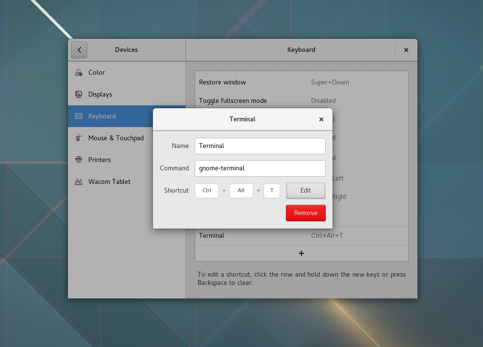
Captura de tela de 2016-07-21 20-45-22
The new Keyboard panel

Working on this panel had me take a few conclusions:

  • The new programming tools and facilities that Gtk+ and GLib landed make a huge difference in code legibility and code quality.
  • GObject is awsome. Really.
  • Since GObject is awsome, lets use all the functionality it gives us for free 🙂
  • I tend to overdocument my code.

And our beloved set of sequential pictures and music:


Excited? This is still unders heavy development, and we just started the reviews. You can check the current state here, or test the wip/gbsneto/new-keyboard-panel branch. As always, share your comments, ideas and suggestions!


16 responses to “The new Keyboard panel”

  1. I use a lot of custom shortcuts / accelerators / hotkeys (I still don’t know the proper term)

    And one thing I encounter a lot is I can’t reorder my custom shortcuts as I bind Super + 1 – 9 to various commonly used applications.

    I wonder if it would be nice to be able to reorder them by dragging them, or if they can be organized a-Z or even if a search box at top would make sense as the number of keyboard shortcuts increases.

    It seems like a excellent start, one list can be nice however once you get to 20 or 30 shortcuts it might take a while to navigate them by eye if you don’t have a memory of where they are before.

    One shortcut I change all the time is the “Hide Windows” or “Show Desktop” I map to Super+D, its just too bad it doesn’t work after several seconds to restore the windows if I needed to do something.

    Also someday I would hope to get a better Icon Desktop more like Plasma, it’s the only feature Plasma has on Gnome in my book as it’s annoying Icons don’t snap to a 1:1 grid especially in a business use case of gnome, but that’s another story.

    Looking great so far 🙂

    1. I just implemented searching through the Keyboard list, if that helps.

      1. ElectricPrism Avatar
        ElectricPrism

        Wonderful 🙂 That will help a lot, now all I have to do is remember keywords and I can instantly locate the binding – thanks 🙂

  2. I have a question: Why are shortcuts keyboard specific? Would it not make more sense to make it general so one can link touchpad or touchscreen, or may be other devices to it.
    E.G. to activate the search view (or how its called) in Gnome one can either press the super key or swipe with four fingers on the touchscreen or on the touchpad.

    1. ElectricPrism Avatar
      ElectricPrism

      So in other worse shortcuts primary link up is with the keyboard, I guess it might make sense someday to select a input type.

      I know when I want to automate a task otherwise not possible via desktop launcher like “Show Desktop” I link up xdotool and a .desktop launcher to imitate the shortcut.

  3. I like it. However, wouldn’t it be better to place that Remove button in the headerbar?
    Like this: http://imgur.com/a/WPySP

    1. the aggreeer Avatar
      the aggreeer

      I agree with this suggestion…

  4. Marius Avatar

    that design is in deed ugly 🙁

    Why do you have to change something that looks good, into something from the 80s ?

  5. […] través de un mensaje en su propio blog y de las capturas llevadas a cabo por Alan Days dentro de su propio espacio web, el desarrollador […]

  6. Jiehong Avatar

    Hello!

    Great job so far!

    2 questions:

    Instead of the closing cross on the top right, could we have a “OK” Button instead? (and the “Delete” one on the right, of course). A bit like the open file dialog;
    Will all shortcuts defined here actually appear in the list of shortcuts presented in a nice window (like this one: https://img.linuxfr.org/img/687474703a2f2f7069782e746f696c652d6c696272652e6f72672f75706c6f61642f6f726967696e616c2f313435383736323036302e706e67/1458762060.png)

    As they are shortcuts, having them in the shortcut window would be awesome!

  7. […] Users panel now joins the Keyboard, Printers, and Mouse, as the new Settings experience. We plan to switch to the new Shell in the […]

  8. […] the GNOME Control Center iterations, you probably noticed it already has a bunch of new panels: Keyboard, Mouse & Touchpad, and other panels like Sharing, Privacy and Search that don’t need to […]

  9. […] a message on its own block and of the captures carried out by Alan Days within his own web space, the developer Georges […]

Leave a Reply

Your email address will not be published. Required fields are marked *

This site uses Akismet to reduce spam. Learn how your comment data is processed.