Files, a new dialog

For those who follow my work, you may know me as a GNOME Calendar developer. Fair enought, most of my code is in Calendar, indeed. But why should I limit myself to Calendar? Hey, GNOME is huge, we can contribute to whatever we want, so let’s do it!

Here it goes, the still-warm just-cooked New Folder dialog:
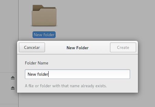
Captura de tela de 2015-04-20 11-14-51Creating a new folder

Captura de tela de 2015-04-20 11-15-14Oops! Something was already there.

Captura de tela de 2015-04-20 11-15-31Don’t let users screwe things up, that’s what they say

And here we are, one more 3.18 target (check Nautilus/Roadmap) accomplished.

What’s next?


16 responses to “Files, a new dialog”

  1. Francesco Avatar
    Francesco

    Neat!

  2. Is there a reason for that change? Modals are in general a bad idea because they lock the interface and cause UX problems (aka changes in midstream). I dont really see a benefit, is this purely for validation purposes?

    1. This is part of the neccessary work for us to reach Nautilus Next. Check it here: https://github.com/gnome-design-team/gnome-mockups/tree/master/nautilus/nautilus-next . Remember that there’s always room for improvement, so if you disagree with the design decisions, jump in #gnome-design at irc.gnome.org and talk with the designers.

  3. HolgerB Avatar

    I’m with John and wondered why you would prefer that to the more direct method used now? If it’s because of the immediate feedback to user when she does something wrong, then you can always use a tooltip.

  4. What invokes the the New Folder dialog? Right-click ‘New Folder’ or a button like Win 7 or something other?

    1. “New Folder” from right-click menu, Control+Shift+n for power users, or Menu > New Folder for fast mouse access.

  5. Peter Weber Avatar
    Peter Weber

    Hello!
    A first note, thanks for your work on improving Nautilus!

    I appreciate new features for Nautilus. I’m sorry to say, but John is right. Actions on items within an application are should be done inline, they belong to the item. Modal dialogs steal the focus and block the user-interface and should be used only for entirley seperated things.
    Just doing it so, because the design team has drawn something wastes your effort. Talk to them! Consider file renaming, you click on that file to rename it and don’t want to move the focus the a new window. Pretty every source about application design explains this.

    A good idea for a small feature which would help everyone:
    A file-browser needs to create files, rename files, move files, copy files and delete files. We can create directories, but since some release we can’t create and empty new file at all. I just not available anymore (and the workaround through ~/Template are crazy).

    Thank you 🙂

  6. While I agree that direct manipulation and inline editing can often be a good thing, those don’t seem to apply in this case, and there are some other factors that need to be considered:

    The existing method of adding folders has known usability issues. This was observed most clearly during usability tests conducted by Intel – the biggest issue here was the lack of a confirmation or cancel button; users didn’t realise that they had to press return, and couldn’t figure out how to get out of the operation when things went wrong. Clicking on other files or folders had surprising results.
    Inline naming of the folder is not true direct manipulation – since after you have finished naming the folder, it moves position and then you have to go and find it again. It is more efficient to insert the folder into its actual location, once it is created, rather than using spurious inline creation.
    Lack of modality causes confusion and errors – if you are in the middle of creating a folder, and try to carry out another action (like copying/moving files, or browsing), the result is unpredictable and typically not what you intend.

  7. Thanks Allan! I understand your argument. While I can live with such a change, I wonder if they tested what does happen to regular users in this case also? I don’t remember any file-browser which does this with a modal dialog?

    Honestly, what bothers me with Nautilus is the missing “create new empty file” thing. It stops the workflow:
    1. Moving files of project around
    2. Create new empty file
    3. foo.cpp
    4. Double click and Gedit or Builder opens it

    It’s like someone has removed “touch” from coreutils. Just it hurts even more.

    1. The sample was a mix of people with different experience, but they were all new to GNOME. If you ask me whether GNOME should be usable by people who have never used it before, then my answer would be yes.

    2. Bruno Boaventura Avatar
      Bruno Boaventura

      ho, There is a simple way to do this. Put any file on ~/Templates directory. Then, right click, “New Document” and select your template. Works with any type of file. 🙂

  8. You now my point. What’s about the people how now GNOME already. Yep, that 99% of the users.

    1. // edit
      What’s about the people who know GNOME already. Yep, that 99% of the users. Change is good thing, if it improves things and only breaking thinks if necessary.

      PS: Thanks for reverting the “Delete-Key-Issue”. Which reminds me pretty much about this.

  9. Shiny!

    Does it know about other special characters like : that aren’t allowed on FAT/NTFS-formatted USB drives?

  10. Thank yoou for this

Leave a Reply

Your email address will not be published. Required fields are marked *

This site uses Akismet to reduce spam. Learn how your comment data is processed.