Say hello to the new Wi-Fi panel

Hello my GNOME friends 🙂

Y’all know that we’re taking big steps to move Settings (a.k.a Control Center) to a brand-new, super shiny layout. As a courtesy of our beloved designer, Allan Day, we have mockups of a new Settings layout that is both modern and preserves (most of) the functionality we already have. He blogged about it in the past.

I found those mockups quite nice, so I decided to work on them!

As YouTube people say nowadays: I’m a simple man. I see a good mockup, I implement it.

Before switching to the new layout, though, we needed to get rid of the panels with a sidebar. Namely: Online Accounts, Keyboard, Network, Printers and User Accounts. Thanks to Felipe Borges, who reimplemented a few panels himself, we were able to progress faster than expected!

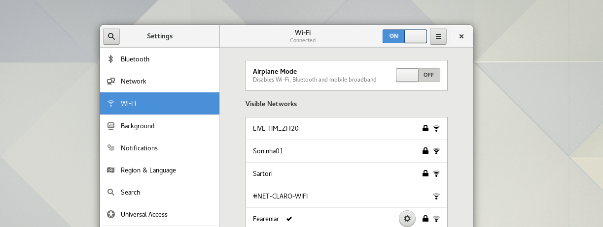
This time, I added the new Wi-Fi panel. Check this out:

The new Wi-Fi panel
The new Wi-Fi panel


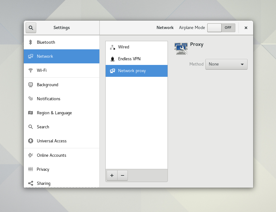
Compare this with the current Network panel, which still has a sidebar:

The current Network panel
The current Network panel. Notice that the panel sidebar looks bad with the new Settings shell (that already contains a sidebar).


With the new Wi-Fi panel, we’re close to making the new Settings shell the default one; the biggest blocker now is the Network panel, which I’m already working on. And finally, after more than a year working on the new Settings layout – and with the help of many super awsome contributors! – we’re almost there 🙂

And our traditional sequence of pictures:


Oh, and did you notice? The connection editor dialog was also redesigned! It’s much simpler and saner now, do try it out and let me know what you think.

The new Wi-Fi panel has a few advantages:

  • It’s beautiful 🙂
  • It handles multiple Wi-Fi adapters slightly better
  • It’s just easier to use
  • (Future) When the host doesn’t have a Wi-Fi adapter, the panel won’t be visible

Afterword

I’d like to say a big and warm thank you to all contributors that made this possible, and specially to Bastien Nocera and Rui Matos for reviewing all this work and many other patches.

There’s still quite a lot of work to do, and it won’t be easy, but we’ll eventually make it 🙂


21 responses to “Say hello to the new Wi-Fi panel”

  1. Quick Review: The “Known Wifi Networks” window that allows you to forget networks looks like the same sort of list as the detected networks list in the main view. In some other systems, they integrate both of these lists to reduce the UI.

  2. […] Laporan resmi dapat dilihat di laman ini. […]

  3. Reader Avatar

    Hi, one question about an issue I’ve never understood: why does the GNOME network settings window show the “settings symbol” (gear symbol) only for the currently connected network?

    Usually, I want to change settings of a network BEFORE I connect to it.

    In my opinion, it would make sense to show the gear icon on hover for any network in the list.

  4. Daniel Avatar

    Simply want to thank you for your amazing work! Can’t wait when the port will be finished. Hope, it’s gonna happen before 3.26.

  5. Looks great!

    Btw: Will the new Settings window be resizeable / maximize-able? That is the biggest annoyance I have with the current one.

    1. Thanks! Yes, the new Settings window is resizable and maximizable 🙂

  6. Mikhail Gavrilov Avatar
    Mikhail Gavrilov

    Sounds interesting. But what about option for share internet wired connection to Wi-Fi network? Or share Wi-Fi internet to local wired network?

    1. Djhg2000 Avatar
      Djhg2000

      I think you still need to use nm-connection-editor to do that.

  7. Marek Suchanek Avatar
    Marek Suchanek

    Thanks for your work, I can’t wait to use it 🙂

    In the new panel, when wi-fi is turned off, the “Visible Networks” container is white and empty. I think it would make more sense and be more comprehensible for the user if there was a label in the middle saying “Wi-fi is turned off”.

    I believe that some people could be confused for a while before finally looking at the header bar; also, efficient space usage!

    1. ElectricPrism Avatar
      ElectricPrism

      Please help me understand the thought process behind having “Network” and”Wifi” be seperate modules.

      It’d be like if I was to have Vehicles and Cars be seperate just because more people look for Cars than Dune Buggies

      Vehicles
      – Trucks
      – Semi’s
      – RV’s
      – Dune Buggies

      Cars

      I think if this divergence is going to take place it makes no sense to use the naming convention “Network”, it would have to be something else.

      This actually brings up an annoyance I have with the KDE System Settings where they used to have something like “Themes” and “Look & Feel” as completely separate modules that had overlapping functionality — very confusing.

      Which brings me to my next point — The Arch Way — sometimes in the pursuit of simplifying we actually make things more complicated — we have to accept that there is a Minimum Simplification Threshold before we have the inverse effect and make things more complicated.

      The cost of hiding and removing features is taking away power from the hands of the capable, and having multiple areas for overlapping functionality will just be a hairy mess fast.

      I hope this thought process helps in future iterations and developments, the work looks great I’m very excited to try out control-center-alt 🙂 on arch.

      1. ElectricPrism Avatar
        ElectricPrism

        Another good example of how the “Minimum Simplification Threshold has the inverse effect and makes things more complicated.” is the Apple File Manager.

        I can’t think of anything more idiotic than having every file on the entire disk available in one giant directory.

        Or have you see the macbook wheel comedy sketch?
        https://www.youtube.com/watch?v=9BnLbv6QYcA

        I’m not saying this is comparable in parallel, but I am noting that having Wifi and Network as seperate modules is really pushing the boundaries between Simple and Confusing, maybe you have some creative ideas about how to solve this confusion.

  8. Incredibeubeul ! It’s a totally new revolutionary idea never seen before ! Wouaou !

  9. Looks great! But I have some nitpicks.

    Signal strength is way on the other side of the network name. Would be much better for it to be on the left.

    Is the settings button really necessary? I would expect to be able to edit any known network by clicking on its row, even when not connected. The modal dialogue can offer me to connect or associate with an unknown network.

    Dividing into two lists, known and unknown, would also be more intuitive. (Like Bluetooth paired vs unpaired) Especially when ordering by signal strength, I don’t want to scroll past a bunch of neighbour networks to find my weak downstairs network amongst the rest.

    Why is airplane mode toggle in wifi if it affects all connections? Is it duplicated all over the place? It feels out of place and could be placed in a more generic spot.

  10. Yuri Vidal Avatar
    Yuri Vidal

    do we still have to use nm-connection-editor to add VLAN tagging, or does the new network manager allow .1q VLANs to be created?

  11. […] di sempre più nuove caratteristiche, un esempio è la recente implementazione del nuovo Wi-Fi panel da parte di Georges […]

  12. […] pannello Wi-Fi di Gnome Control Center 3.25.4 (versione “pannellizzata”) sviluppato da Georges Stavracas semplicemente perché nel Desktop non ho il Wi-Fi. […]

  13. […] Split Details panel, Wi-Fi, Network, more work on […]

Leave a Reply

Your email address will not be published. Required fields are marked *

This site uses Akismet to reduce spam. Learn how your comment data is processed.