Introducing Settings (or, the new Control Center)

Greetings my friends,

if you’re following the GNOME development closely, you’re now more than aware of this movement of reworking GNOME Control Center. It was a remarkably colossal work, specially because we used a bottom-up approach: fix the panels, then switch to the new shell.

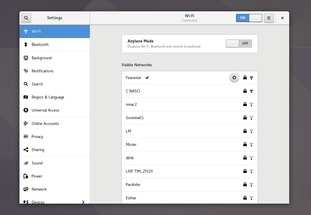
With the release of GNOME 3.25.91, I’m proud to say: the new Settings layout is the official one now.

This is how it looks like:

Captura de tela de 2017-08-23 21-00-21
The new Settings app

A Long Road

… It all began one year and a half ago. I wrote about it at the time, remember? 🙂

When Jon McCann and Allan Day expressed their vision of how a Settings application should work in the form of mockups, I was particularly excited with them. Specially because, with these mockups, we could easily make Settings work on low resolution displays, which is a very important feature for Endless. Since I adapted GNOME Control Center downstream for them, and we all agree that upstream would be better, it made sense for them to support me working on the new Settings layout.

Chronologically speaking, this is how the work unrolled:

Overall, it took 18 months of work from 15 different people (some more involved than others) and more than 30.000 lines of code changed. This work was massive. Thanks to all the contributors who gave their time and energy for free in order to make it happen.

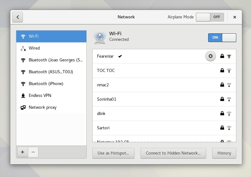
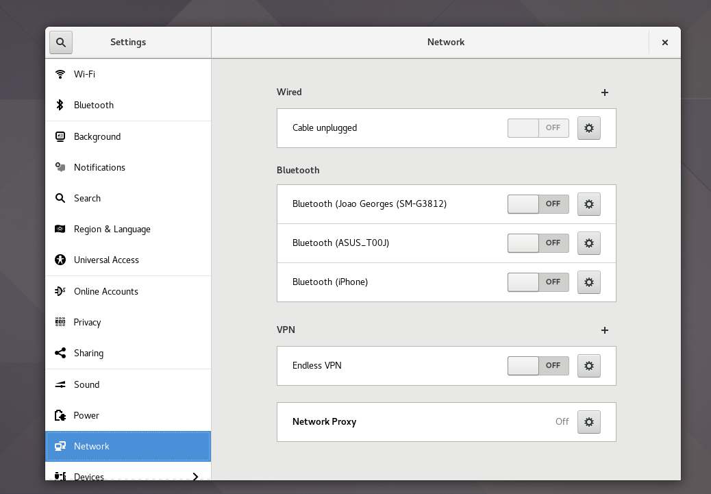
The new Network panel

You read that right. The last big panel that required an update was Networks. This because it used the old 2-column layout, as you can see here:

Old Network panel
The old, 2-column Network panel

While this layout worked well enough with the previous Control Center layout, it would be inconsistent with the new Control Center layout, since both the panel and the shell would have a sidebar. Thus, we could not set the new Control Center shell until we fixed these panels with 2 columns.

But fortunately, using my remaining energy and abusing the super awsome Rui Tiago Matos’ review capabilities, we managed to review this old mammoth panel and the result is actually nice! This is how it looks now:

New Network panel
The new, single column Network panel

This panel, however, is not final; we’ll do another UI review for the next cycle, and split the cellphone Bluetooth connections into a new panel called Mobile Broadband. The advanced connection editor dialog also received a very needed UI review as well:

Improved connection editor dialog
The improved advanced connection editor dialog

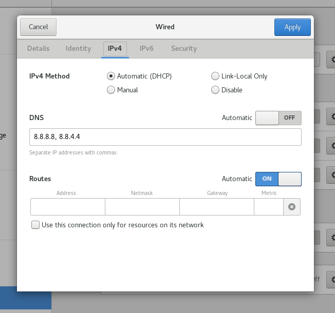
This, as you can imagine, is also not final. The idea for the next cycle is to continue improving this dialog so that we can present the same (or even more) ammount of options in a much saner and simpler way, avoiding confusion and misconfigurations.

Introducing Settings, the new Control Center

Settings is the rebranded name of Control Center. I won’t be mouthful here when I can show you that, right? There you go:


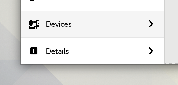
Thanks to Jakub Steiner, the Details and Devices rows have dedicated icons that looks super great! Check this out:

New Icons
The new symbolic icons in Devices and Details rows

Allan, Rui and I spent the past couple of weeks fine tuning tons of minor details and the overall behavior of the new Settings layout. More than 40 minor improvements landed in the mean time, and we can expect even more during the next week.

Next Steps

Improve the Sound panel, do another UI iteration over the Network and Wi-Fi panel, introduce the Mobile Broadband panel and fix all the countless bugs that appeared because of this work.

All in all, I’m personally loving how this work went; how many contributors appeared and gave their personal touch to this work; and also, how supportive and positive the community reception was.

(Pshh, only between us; the GNOME community – both users and contributors – is just awsome!)

Of course, as one can imagine, this work was not without flaws. Lots of them were caught early in the cycle, but some issues will only be found by users testing this new work. So, if you’re not sure about how to start contributing, let me reassure that testing the new Settings and filing bugs would be a tremendous contribution. Bonus points if you provide a patch fixing that issue!

Acknowledgements

Many contributors were involved in this colossal work, but I’d like to personally thank Felipe Borges, Bastien Nocera, Allan Day, Mohammed Sadiq and Rui Tiago (in no particular order) for their role on this work, ranging from UI review, panel porting and code review.

I’d also like to thank my employer, Endless, to support me work on this since the very beggining. While this was not my main focus of work, without the support, it wouldn’t be possible at all.

Because, if you still didn’t know…

banner down


45 responses to “Introducing Settings (or, the new Control Center)”

  1. Yay!

  2. Khurshid Alam Avatar
    Khurshid Alam

    Where is the system wide proxy settings dialog? Was this removed?

    1. Of course not, it’s the last row in the Network panel.

      1. I think Khurshid is referring to an Ubuntu patch that enables setting the proxy for all users. That patch needs to be rebased against the new Network panel.

  3. It looks great, and very clear! Awesome work! Could use some colorful icons though. 🙂

  4. Looks nice.

    But why is the main on/off set on the titlebar like for the ‘search’? It’s kinda out of the way. I’d assume it is there just to have it somewhere and it couldn’t be decided where.

    Wouldn’t it make more sense to have it on the left menu? Or at the top of the main content of the window (below title bar)?

    1. Well spotted!

      We are starting an effort to standardize the positioning of these switches. See https://bugzilla.gnome.org/786756 for instance.

      Patches are welcomed for other dialogs across g-c-c.

  5. Dylan McCall Avatar
    Dylan McCall

    I really like this! Looks fantastic and very organized.

    I’m a little puzzled by the design of the Users panel. Do you know if there was a reason it isn’t more like the Printers panel, for instance? The fancy user picker at the top is rather different, so I’m just curious why you went with it 🙂

    1. Thank you!

      I myself didn’t actually follow the design iterations over the Users panel, thus I won’t dare to say the reasonings behind it. You can ask Felipe, Andrej and Allan about it – I’m sure there are reasons for the coice.

      1. The GNOME design interactions are recorded at https://wiki.gnome.org/Design/SystemSettings/UserAccounts#Tentative_Design

        Jakub Steiner (jimmac) is the best person to ask about the reasoning behind these features. Sorry to refer to someone else after being referred by someone else. 😉

  6. Date&Time and Users under Details???

    1. That’s right.

      1. I don’t understand why these options can’t be on their own as a “first-class” section, sincerely.

  7. Looks good!
    The current settings (3.24.3) never made much sense to me. 3 “main categories”: Personal, Hardware & System – Isn’t your hardware also part of your system? Why is “Color” under “Hardware”? Why is “Region & Language” under “Personal” but “Users” under “System”?
    Plus in German localisation “Personal” ist named “Privacy” (Privatsphäre), so there is a “Privacy” sub category in the “Privacy” main category…

    Two questions:
    How did you sort the items in the sidebar? By “popularity”, say how often they are probably used?
    Can the icons still be changed by themes?

    Thanks for you work again, looking forward to Fedora 27 release 😉

  8. meloidia Avatar

    This kind UI improvement is interesting, but not that urgent in terms of usability. For example, I use Arch Linux and never succeed in finding my printer via gnome control center. I have to use Firefox to open localhost and install a printer, then use it under GNOME stuff… like some joke.

    1. Hi, can you elaborate on this? I’d like to make the necessary adjustments to the Printers panel to cover your use case as well.

      1. meloidia Avatar

        Thanks. The printer is a common HP color jet, and locates in the same LAN with my linux box. The GNOME control center could prompt the printer sometimes, but when I click to install it, the control center just fail to do any work. But if I install it under firefox via its localhost port, the control center displays it. Sometimes the panel even doesn’t response. Maybe the printer searching stuff should work in a separated background thread. This same problem happens in recently released several GNOME versions.
        I respect the excellent UI improvements you done, but I think it’s more important that the things can work. Most of time we need the computer working, and most of complaining about open source softwares is not that they don’t have good looking UI, but they don’t work.

  9. Would be nice if the connecting to a defined vpn upon establishing a network link will be an available a an option in the network panel. As is possible using the nm configuration gui.

  10. It’s interesting we had a sidebar in GNOME 1, then moved to the previous iteration and now we cycle back round to a sidebar.

    1. thats how ‘design’ works

  11. I wouldn’t call it a regression but a few design choices seem a bit odd. There is the Network/Wifi split even though the very first entry in the network tab is actually “Wired”. Then, where does the arbitrary second level hierarchy come from? Why is Date/Time or Users less important than say Universal Access?

    1. Indeed it makes no sense to have “Users” and “Date&Time” under “Details”. Also “About” could be a in the main sidebar and maybe pre-selected so that you can see its content when you launch gnome-control-center

  12. Details tab should ONLY have about and system information. Users and Date & Time have no place there. That makes zero sense.

  13. […] avrà un look completamente rinnovato. L’annuncio è stato fatto ieri dallo sviluppatore Georges Stavracas che ne ha annunciato la disponibilità per GNOME […]

  14. […] look completamente rinnovato. L’annuncio è stato fatto quest’oggi dallo sviluppatore Georges Stavracas che ne ha annunciato la disponibilità per GNOME 3.25.91. GNOME Settings (questo il nome del nuovo GNOME Control […]

  15. […] center avrà un look completamente rinnovato. L’annuncio è stato fatto ieri dallo sviluppatore Georges Stavracas che ne ha annunciato la disponibilità per GNOME […]

  16. Congratulations to you and all involved! I know this must have been a very long and challenging task. Great job.

  17. […] avrà un look completamente rinnovato. L’annuncio è stato fatto ieri dallo sviluppatore Georges Stavracas che ne ha annunciato la disponibilità per GNOME […]

  18. […] avrà un look completamente rinnovato. L’annuncio è stato fatto ieri dallo sviluppatore Georges Stavracas che ne ha annunciato la disponibilità per GNOME […]

  19. Why there is an entry for Bluetooth, and another Bluetooth under the Network?

    1. Bluetooth category in the Network panel is for bluetooth modems, the standalone Bluetooth panel is for general purposes.
      In other words, you connect with your phone using Bluetooth panel, enable Bluetooth tethering on the phone, go to Network panel and connect to mobile internet from there.

  20. Thank you for your work, Georges!

  21. […] avrà un look completamente rinnovato. L’annuncio è stato fatto ieri dallo sviluppatore Georges Stavracas che ne ha annunciato la disponibilità per GNOME […]

  22. […] salah satu pengembang yang mengerjakan hal ini, resmi membenamkan GNOME Settings di GNOME 3.25.91. Dalam tulisan terbarunya, Stavracas memamerkan perubahan pada panel Network yang kini memiliki kolom tunggal. Lihat di bawah […]

  23. This has been a highlight in following your blog, great work!

    Simplicity, Consistency and Quickness are some of the biggest draws for me as a Gnome user.

  24. Please merge Tweak tools feature in the settings. Having 2 ‘settings’ is not efficient.

    1. pibarnas Avatar

      +1

  25. Étienne BERSAC Avatar
    Étienne BERSAC

    Hi,

    Excellent work. The new design looks more original and is smarter.

    Do you plan to spread Networks panels or to gather them in a “Network >” sub menu (like Details and Devices) ? I do like the idea of having Wifi, Proxy, Broadband, etc. gathered.

    This with the new GNOME Tweaks make a great improvement for 2.26. Kudo !

    Étienne

  26. […] looking simple and intuitive, and yet we present the same ammount of features! I wrote about it in this blog post. Even though this work was huge, and I am feeling mentally tired after this battle, I’m also […]

  27. Linux User 42 Avatar
    Linux User 42

    I am sorry but this is complete rubbish. No, don’t care for your post-hoc rationalisation for your design to change shoot because you got excited about some mockups.

    You take something that is very familiar to not only your current users but also potential users from other platfroms and turn it into a character less joke of a full page text nonsense.

    As others have mentioned, the categorizations make no sense.
    Wifi is not Network?
    Sharing bullshit is more important than local/system users?
    Why the fark do I need to search around to set my computer time?
    Why is Sound more important than Displays?

    What kind of whack thought process produces this kind of utter nonsense?

    The year of Linux on Desktop is the year after when desktop development is following when the knee-jerk-reflex-driven redesigns on a whim that wastes users hours and hours for no good stops and instead the development is driven by a meaingful set of principals that focuses on user gratification.

    On another note, where the do I set my data and time?

Leave a Reply

Your email address will not be published. Required fields are marked *

This site uses Akismet to reduce spam. Learn how your comment data is processed.