Greetings, GNOME friends!
I’m a fan of productivity. It is not a coincidence that I’m the maintainer of Calendar and To Do. And even though I’m not a power user, I’m a heavy user of productivity applications.
For some time now, I’m finding the overall experience of GNOME To Do clumsy and far from ideal. Recently, I received a thank you email from a fellow user, and I asked they what they think that could be improved.
It was not a surprise when they said To Do’s interface is clumsy too.
That motivated me to experiment and bother our designers about ways to improve GNOME To Do. With the great help of Tobias Bernard, a super awsome contributor, we could figure out a way to improve the current situation.
Opaque Task Rows
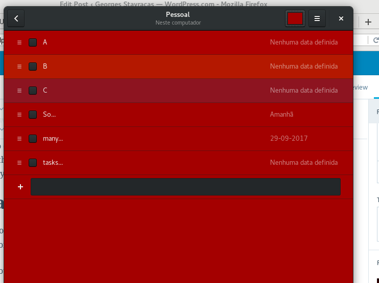
One of the problems of GNOME To Do was the translucent task rows. Priorities would be semi-transparent colors applied on top of transparent rows.
Of course this mess could lead to things like this:

After some investigation, a lot of experimentation and feedback from multiple design team members, we could come up with this:

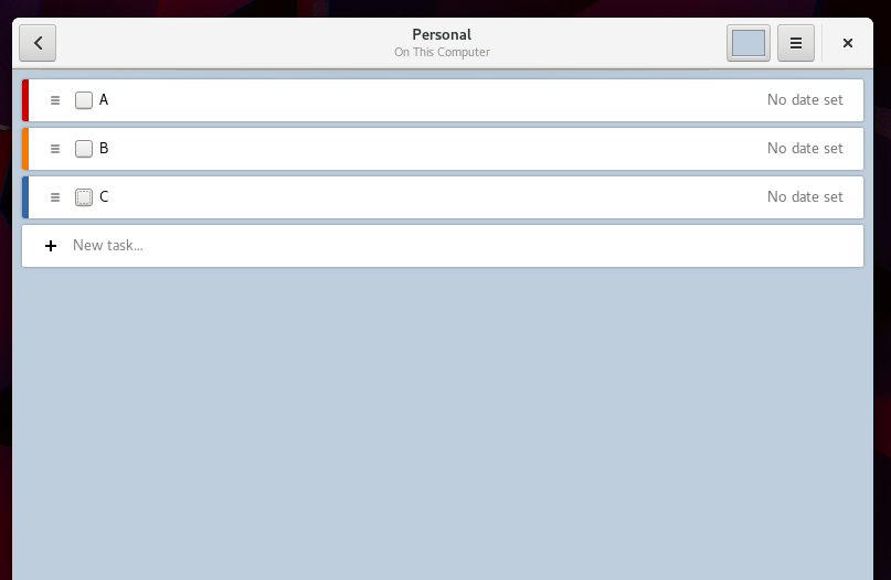
I personally think this is a small, but huge improvement over the previous state. When you have to stare at tasklists for hours, the minor annoyances are what causes the biggest frustrations.
Inline Editing
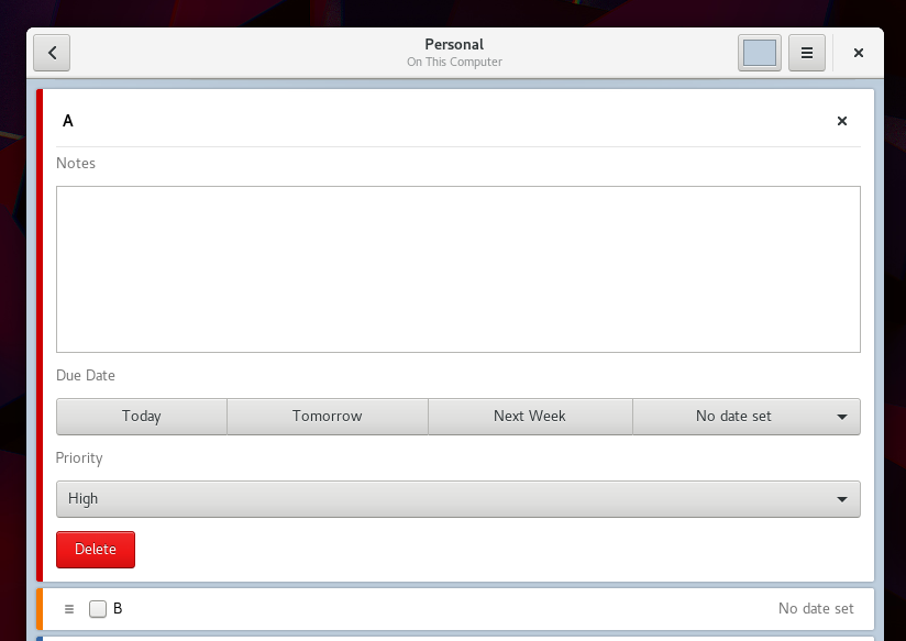
Another big aspect of To Do that was the task editor panel. This was initially made based on some old mockups, but this proved to not be the ideal experience.
The biggest problem was that there were no connection between the editor and the task. Of course there is an arrow pointing to the task row, but consider that:
- The task title is edited in the task row
- All other fields are edited in the side panel
- The arrow might now be obvious to spot
- The real representation of the task was the row, not the panel
So Tobias suggested me inline editing of tasks. I went ahead and implemented it, and the result looked actually very good!

The necessary width was reduced, and now the window can be shrinked to small sizes. And it works nicely on Dark Themes too:

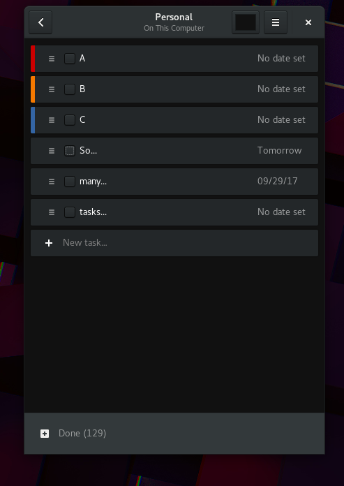
This work already landed on master, and will be part of GNOME To Do 3.28. And, of course, our traditional sequence of images:
Any comments? Thoughts? Please let me know in the comments! And don’t ever forget, you can always get involved – you just need to get in touch, and join us at #gnome-todo at irc.gnome.org.
Enjoy!
Looks great!
In the figure with caption “Editing the task where the task is represented” there are two things that confuse me:
1) For task A, what does the X button in the upper right corner do? Does it delete task A? Does it collapse the expanded view of task A?
2) Why is the “Delete” button in the bottom? I thought Gnome had action buttons like this in the top of a window.
Søren
LikeLike
Hi Søren, thanks for the feedback!
You’re absolutely right about the X button, and also about the Delete button. So far, these changes only affect the task rows – I just packed the previous Edit panel inside them.
Now I’ll take some time to rethink the task editing widgets. I thought about having an responsive layout where groups of widgets would be packed side-by-side, or vertically, depending on the available width.
LikeLike
I had the same problem, wandering about the X button as well.
I think this should rather be some arrow to make clear that it collapses the inline editor.
Does clicking outside the editor pane work as well to collapse it?
Steffen
LikeLike
Looking good.
Two things come to mind though:
1) The X button at the top right of an expanded task. This button usually means closing something and make it go away. In your case, however, it only collapses the task. Like the comment from Søren above, this confuses people. You constantly wonder if it will just close the task or if it will get rid of it so you’d have to recreate it. Consider changing the icon and maybe even the position. You would normally see a collapse/expand control before the label/name, in e.g. a tree list.
2) I do hope that clicking on a collapsed task will collapse the current task and expand the new one automatically. This will prevent having to perform two actions instead of one (collapse first, expand after).
LikeLike
Yeah, (1) will be tackled during next week, and (2) already works as expected – only one expanded task row at time.
LikeLike
Hi GEORGES,
Looks great but couple of input:
In “Today” or in “Scheduled view”,
1) If a task-list uses a specific color then, then all task belonging to that should use same color indicator in the main view regardless of it’s priority. That’s what Todoist does. That’s what we do in calendar.
But here We are setting priority indicator in the left side. Why is that? Why priority indicators are so important that we must show it as a color indicator and why does it overwrite task-list color?
How does people will differentiate which task belongs to which task-list if we have more than one task with same name? Reading faded task-list name on task is inconvenient.
I feel color indicator should be the color of the task-list it belongs to and not priority color. Inside task-list your implementation is fine.
2) If showing priority is so important why don’t we show it as separate indicator along with task-list indicator in the main view? It can’t small horizontal indicator in the right (that’s what ios does). Or it can be a number.
Thoughts?
LikeLike
Does it sync with my phone and across the different computers I’m using? That’s my first and most important requirement for a todo app.
LikeLike
Well, I use GNOME Online Accounts to sync the tasks from my Nextcloud instance. On my phone I sync the same tasks using DAVdroid. With that you got all of your info at your fingertips.
LikeLike
The “Priority” combobox looks kinda strange, with a full width. Why not use buttons labelled “None”, “Low”, “Medium” and “High”, the same approach as in “Due Date”?
LikeLike
Hi Ian, read my reply to Søren’s comment – these editing widgets will be redesigned too during this cycle (I just updated the task rows at the moment.)
LikeLike
This looks really good. Maybe the edit menu can be even more compact by putting some things side by side instead of on top of each other?
One unrelated feature I would love to have is the possibility to turn off alphabetic sorting, so that I can order the items myself by dragging the items around (and after completing a task it should stay in the same position, just striped through). Maybe having alphabetic sorting turned off should even be the default? What do others think?
LikeLike
So…… the primary role of a to-do app in my life is to see how long I can procrastinate. I wonder if it would be possible to include a feature that answers the question: “If I start on this to-do list now, and do everything on it one item after another, at what time will I be finished? Can I put all this off for another 45 minutes?” 🙂
LikeLike
Have you ever considered taking some (not limited to) visual inspiration from OmniFocus (https://www.omnigroup.com/omnifocus) They nailed some of the usual challenges of to-do apps and have also built a very flexible and powerful app around the interface.
LikeLike
also GNOME Notes (Bijiben) needs an equal treatment!
LikeLike
Looks much better than before, nice work!
I second the call for improvements to GNOME notes, it could use some love ❤
LikeLike
Dear Georges,
thanks (one more!) for your great work on the GNOME productivity tools – my personal everyday life organization has seen a dramatic improvement owing to your contributions to various GNOME projects.
Tasks indeed was a bit clumsy to work with (we were in email contact a few months ago) and I’m thrilled to see you working on this again!
While I really like the changes you proposed above, there is one feature I am really missing, which is implemented in the Android “Tasks” app that I sync with my Nextcloud instance, but not (yet) in GNOME To Do: it allows to add item lists (with markdown-style syntax) to the task and scales the progress according to the number of list items checked. This is a very handy way to work on tasks without relying on subtasks – which is supported by some front-ends, and not supported by others.
Maybe you could work on something like this at some point…
Cheers and thanks for the great work!
Simon
LikeLike
Awesome!
“The necessary width was reduced”, does this also mean the width needed for the overview mode is also reduced? I really like to use ToDo vertically but the stack switcher and buttons on the headerbar always prevent it.
Also I would like better integration with other software, for example I use Open Tasks on Android which also supports syncing via NextCloud, but the issue is many stuff like sub-tasks aren’t compatible on either side. (I don’t really know which is at fault, and whether there is a standard for the data structure used or not…)
LikeLike
It is nice, but I would prefer to see an important feature : caldav support for syncing.
LikeLike
This is already possible – just add your account to the GNOME online accounts and everything is synced automatically!
LikeLike
EDS backend integration is broken for online task-list at the moment. https://bugzilla.gnome.org/show_bug.cgi?id=782541
LikeLike
It would be great if such applications would be provided as AppImage/Flatpack/Snap package. Currently although i like the changes it will take at least a year or more before i will be able to test and use it.
LikeLike
Apologies for the OT comment, but I use the revamped gnome-to-do a lot and I was sure tasks used to appear in the calendar panel of gnome-shell once. I cannot find an option for it any more. Is there a way to have the upcoming tasks shown?
LikeLike